CASE STUDY / 04
ALPINE
FLEET
A premium transfer website where route clarity and destination confidence matter as much as visual polish.
01 / CONTEXT
FROM AIRPORT
TO ALPINE ROUTE.
The challenge was to make a premium transfer brand feel reliable and directional, not generic. The clearest expression of that is the route atlas moment.
02 / ROUTE ATLAS
WHERE ARE
YOU HEADING?
Inside the project chapter, Alpine's deep teal map world and pink route accents take over to explain the network visually.
ACTIVE ROUTE
LYS → TIGNESLYS →
TIGNES
03 / STRUCTURE
GRAPHIC ENOUGH
TO GUIDE.
The rest of the site returns to a clearer Root-framed system: destination hierarchy, calm booking flow and strong typographic confidence.
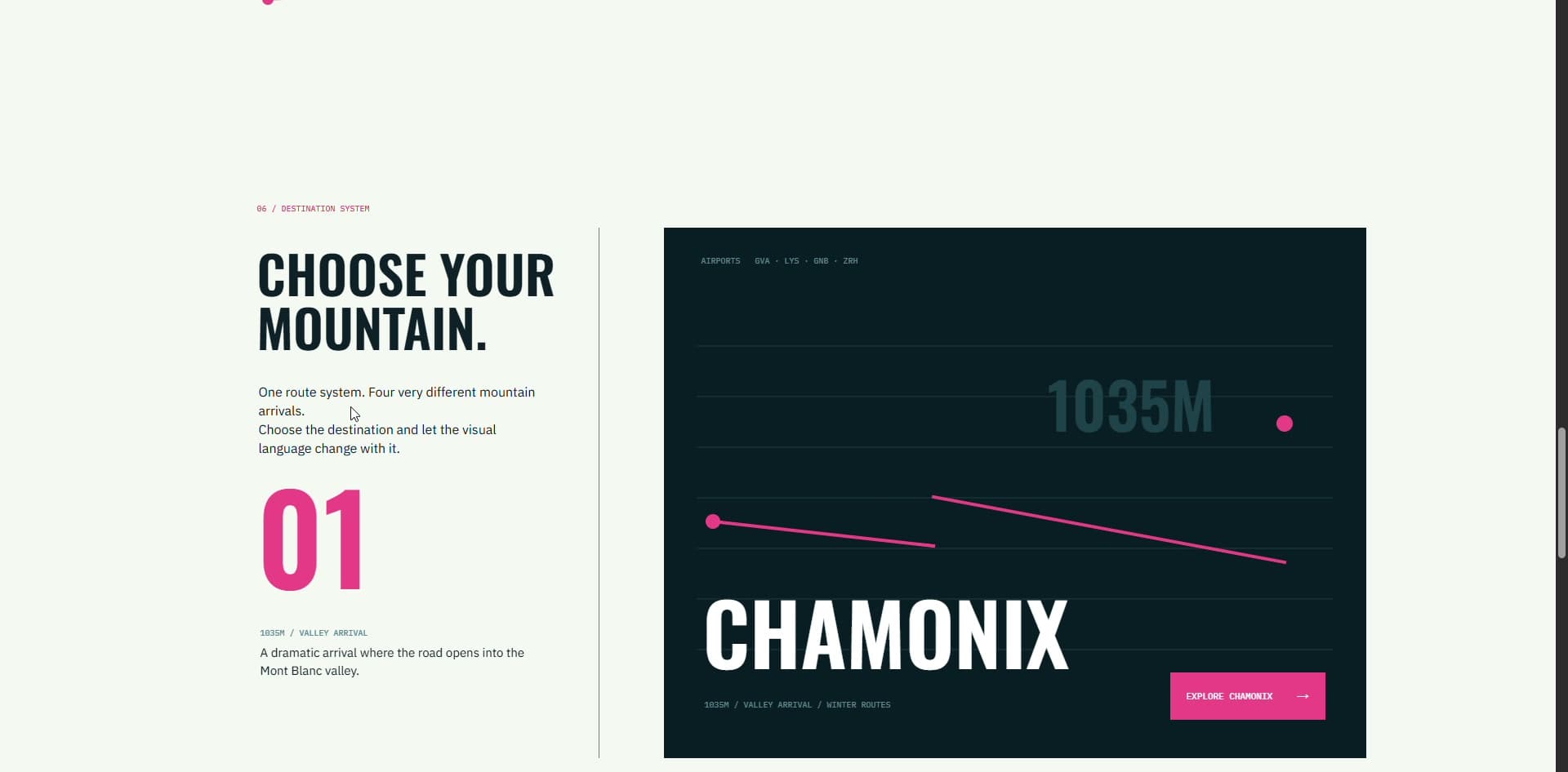 ALPINE / DETAIL
PROJECT STATUS
DESIGNED / DEVELOPED / DELIVERED
Travel digital experience for a premium transfer service.